Background
At the beginning of my UX journey, I was partnered with a startup called Rockhopper. In the the kickoff meeting the founders explained their vision for a tool that could transform how financial professionals collaborate. They were drowning in spreadsheets and long email chains, and they needed a better way to work together.
Our team was tasked with designing an MVP for a collaborative document annotation system that would streamline communication and reduce friction in team-based financial work.

Work
About
Problems In The Workflow
To understand the problem and the space, we wanted to talk to financial professionals who often collaborate with their team or other departments. The purpose of the research is to understand their workflow and find pain points and opportunities to optimize their work and communication.
Through these interviews we were able to uncover insights and frustration when working on documents in teams.


Forced Sign-Ups
Users must subscribe before exploring the service, which boosts sign-ups but often causes frustration and early cancellations.
Limited Preference
Meal kit services lack personalization, making it hard for users to find meals that align with their dietary needs and preferences.
Inflexible
Traditional grocery shopping is flexible but time-consuming, while meal kit services save time but lack flexibility.
Understanding The User
After conducting the research, we quickly realized that there were two sets of users that we have to take into consideration. One user will be the owner of the document and share with a team member. It was important to take both of these users into consideration when designing a solution.
Where Can We Optimize?
Turning the problems that we uncovered we turned them into design goals to benefit both the Sender and the Receiver.
Facilitate offline collaboration
Foster alignment across teams
Maintain document hygiene
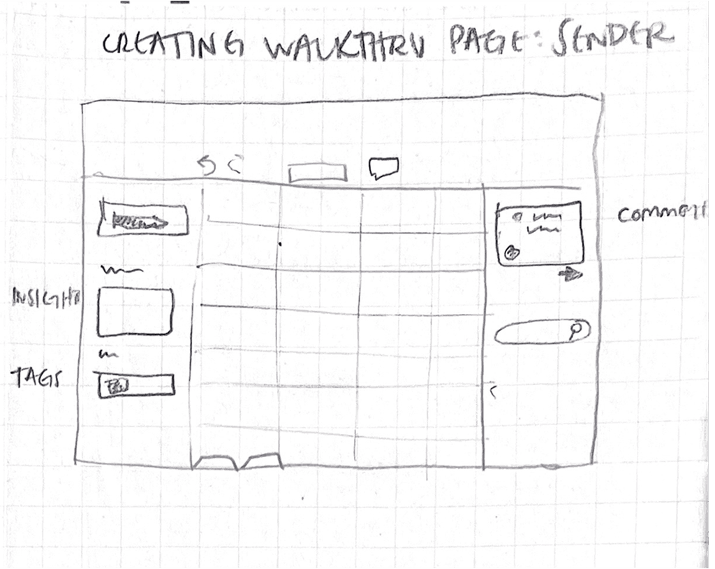
Iterating The Workflow
In order to design a solution based off our design goal we came up with an idea that assigning tasks to each members on the document. The owner of the document can assign these tasks in order to ensure that the document is being inputed and reviewed with the correct information.
We explored the idea with a right side bar to handle these actions to ensure a productive workflow and enabling the users to through the same document. Here are some of early design concepts through sketches.


The FreshBite Experience
Smart Header for New and Returning Users
We designed a header element that shows users how many meals they have left and gives them quick access to manage their subscriptions.
For first-time users, this element highlights the value of signing up for FreshBite by letting them explore what the service offers to encourage user sign-ups.